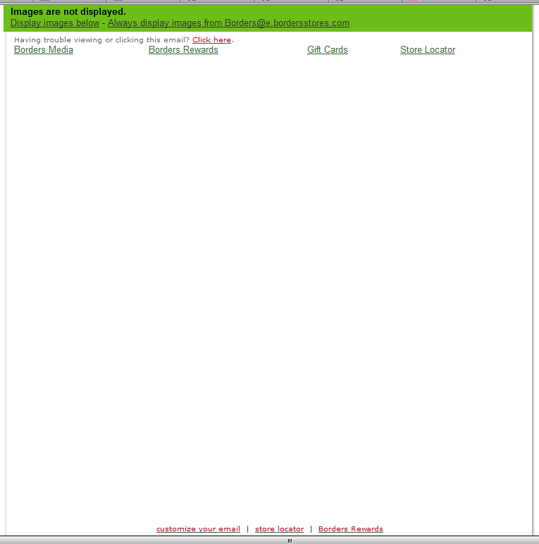
 It's really surprising how often I get emails from large companies with a solid online presence that are complete and utter shite. They are all screwed up in different ways too, I mean, it almost seems like they are trying new and creative ways to entice me not to buy their junk. The example off to the right is the most common, a big ol' blank email – usually with just an unsubscribe link at the bottom. Take this latest example from Borders. I recently signed up with their rewards card program so I git this email, and what an email it was, a blank page with 8 links on it. Not exactly what you would call an award winner. Now check out the actual email as it is intended to be viewed. The vast majority of this email is text, yet they decided it was better to drop all of the text into and image rather than take the time to build it properly and get effective penetration with it. Granted, in this instance it was something I was expecting to receive (since the gal at Borders asked for my email addy), but it's still lazy development. In fact, the only reason I didn't simple delete it is because I signed up for something which led me to receive it.
Maybe next time, rather than delete it i will click the link in the email, fill up my shopping cart and abandon it – 15 times. Why? Just to mess with their metrics.
I've covered this sort of thing before, but it never fails to amaze me – especially from companies that have an otherwise excellent online presence and program. I liken this to restoring a beautiful 53' Ford, then taking to Earl Sheib for the paint, you don't spend 25k on a hot rod just to put a lame $400 paint job on it. That's like deckin' yourself out in Bobos.
Somehow this all reminds of Dilbert…..